
Website design: theme, header & footer
Design is where the website becomes yours — your colours, your fonts, your navigation. It is deliberately site-wide: one change reaches every section on every page, so a site can never end up with a different blue on each page or a footer that says something different halfway through. Sections themselves carry no colours or fonts; they take them from here.
How it works
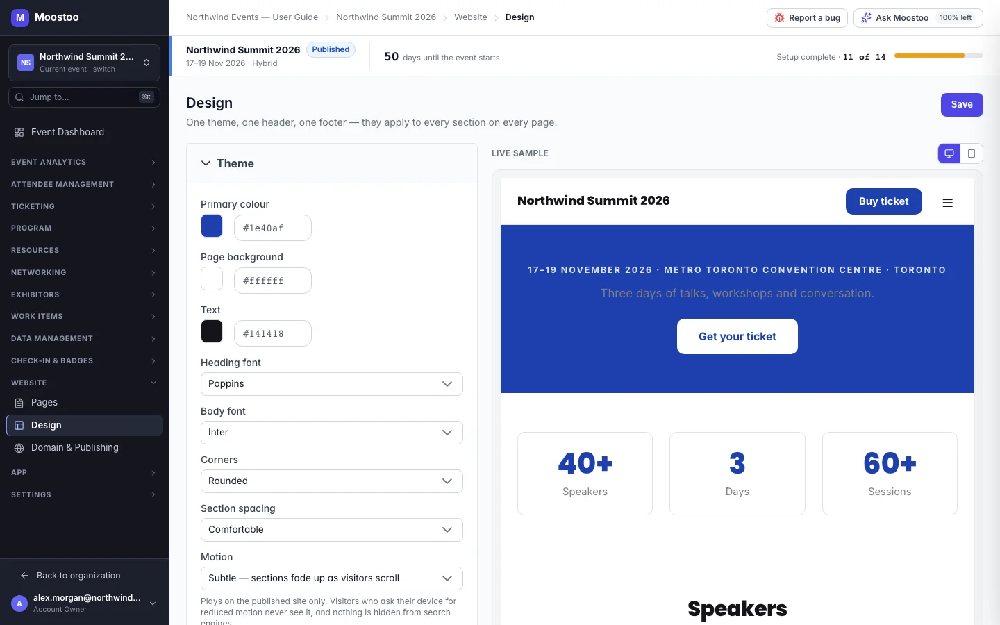
Open Website → Design. The screen has three panels — Theme, Header and Footer — and a Live sample beside them that redraws as you change anything, at desktop or phone width. Changes are not applied until you click Save; once saved, they apply to every page of the published site straight away, without republishing each page.
| Setting | What it controls |
|---|---|
| Primary colour | Buttons, links and accents. Softer tints and borders are derived from it automatically. |
| Page background and Text | The page surface and the main text colour. A dark background gives a dark site — the derived borders and muted text follow it. |
| Heading font and Body font | Chosen from a fixed list of web fonts that Moostoo hosts itself, so they always load and every one has a real bold weight. |
| Corners | Square, Slightly rounded, Rounded or Very rounded — cards, buttons and images alike. |
| Section spacing | Compact, Comfortable or Spacious — the breathing room between sections. |
| Motion | None, or Subtle — sections fade up as visitors scroll. Visitors whose device asks for reduced motion see no movement, and nothing is ever hidden from a visitor whose browser does not run the animation. |
Header Logo, site title, a layout (Logo left, Logo centred or Minimal), whether it sticks to the top while scrolling, the Navigation menu — your pages in order, each with a show/hide switch and an editable label, plus any external links you add — and an optional button (text and target page or address).
Footer A layout (Columns, Compact or Centred), an About this event text, copyright, social links, footer links, a contact email and a privacy policy link.
The header and footer are structured on purpose rather than free canvases: they carry the site's navigation and its phone behaviour, which is what keeps the menu usable on a small screen. On a phone the header collapses into a menu button according to the layout you chose — there is no separate mobile header to maintain.
Step by step
Open Website → Design.
In Theme, set the primary colour, background and text colours, pick a heading and a body font, and choose corners, section spacing and motion.
In Header, choose a logo from the Media Library, set the site title and pick a layout. Turn on Stick to the top when scrolling if the header should stay visible while scrolling.
Under Navigation menu, reorder pages, hide the ones that should not appear, rename labels, and use Add an external link for addresses outside the site.
Optionally fill Button text and Button goes to — a page of your site or an address.
This is the place for Buy ticket or Register.
In Footer, pick a layout and fill in the description, copyright, social links, footer links, contact email and privacy policy link.
Check the Live sample at desktop and phone width — links in the sample open a full preview of that page — then click Save.
What attendees see
On the event website
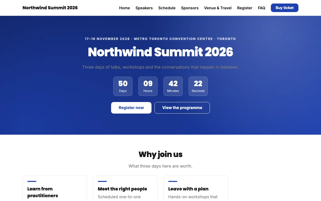
Every visitor sees the same header, footer and theme on every page. Saved design changes reach the live site without republishing pages; hidden menu items stay reachable by their address but no longer appear in the navigation.
Tips
- Check contrast after changing colours: light text on a light primary colour makes every button hard to read.
- Choosing a new template replaces your design as well as your pages.
- The browser tab icon (favicon) is not set here — it is the event's, set in Settings → Event Assets beside the event logo and shared with the attendee app. The page order in the navigation menu also follows the drag order on Website → Pages. See Domain & publishing.
- Keep the navigation short. Five or six items read well on a phone; hide secondary pages and link to them from within a page instead.