
Home screen
The home screen is the first thing attendees see every time they open the app, so it should answer the question they have right now: what is next for me, who should I meet, what did the organizer just announce. Turning sections on and off and ordering them lets you tune it to your event — a networking-heavy event leads with people to meet, a conference with what is up next.
How it works
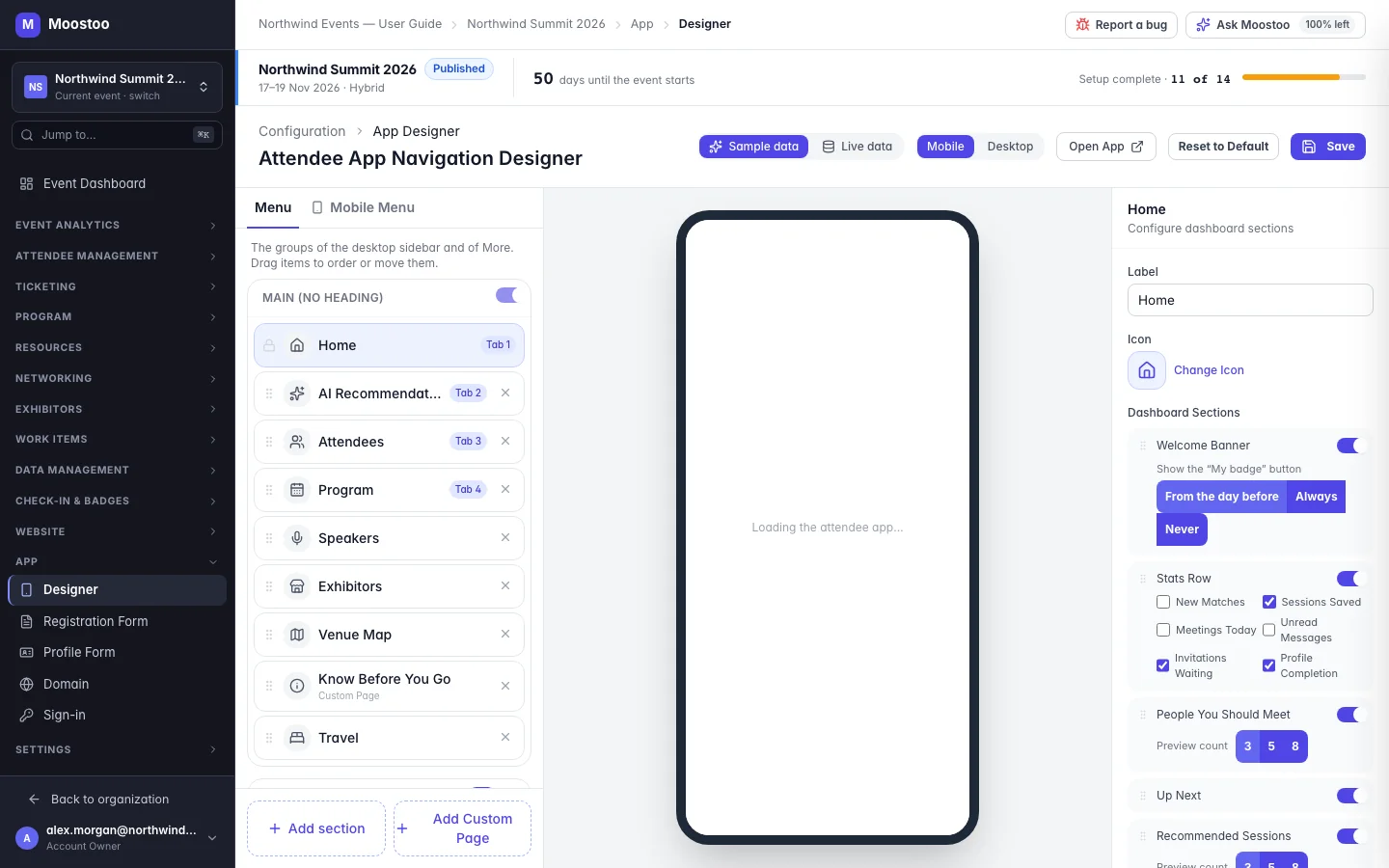
In App → Designer, click Home in the menu. Its panel lists the Dashboard Sections. Each can be switched on or off and dragged into order; some have extra options.
| Section | What it shows | Options |
|---|---|---|
| Welcome Banner | The event's banner and name, with the attendee's greeting. | Show the My badge button: From the day before (default), Always or Never. Not offered for online events. |
| Stats Row | Small counters about the attendee's own event. | Pick the counters: New Matches, Sessions Saved, Meetings Today, Unread Messages, Invitations Waiting, Profile Completion. |
| People You Should Meet | The attendee's best AI matches. | Preview count 3, 5 or 8. |
| Up Next | Their next session or meeting. | — |
| Recommended Sessions | Programme sessions matched to their interests. | Preview count 3, 5 or 8. |
| Today's Agenda | What is on their agenda today. | Preview count 3, 5 or 8. |
| Happening Now | Sessions under way right now. Off by default. | — |
| Announcements & Polls | Your latest announcements and open polls. | — |
| Featured Content | Reserved for featured content. Nothing can be featured yet, so it stays empty for attendees — leave it off. | — |
- Sections follow the pages they come from. People You Should Meet needs the AI Recommendations page, Recommended Sessions needs Program, and Today's Agenda needs Agenda. If that page is not in the menu, the panel warns you — attendees would see an empty card.
- The My badge button is time-aware. From the day before shows it from 24 hours before the event starts until the event ends — when attendees need it at the door, and not weeks earlier.
- Some things are always there: a banner inviting attendees to join an online meeting that is starting, and the profile-completion ring until their profile is complete.
- The layout adapts. On a computer, a Welcome Banner placed first spans the full width, Announcements & Polls sit in the side column, and Recommended Sessions and Today's Agenda share a row when they are next to each other.
Step by step
Open App → Designer and click Home in the menu.
Switch on the sections you want and switch off the rest.
Drag sections into the order attendees should read them.
For the Stats Row, tick the counters to show; for the list sections, choose a Preview count; for the Welcome Banner, choose when to show the My badge button.
Check the result in the preview, then click Save.
What attendees see
In the attendee app
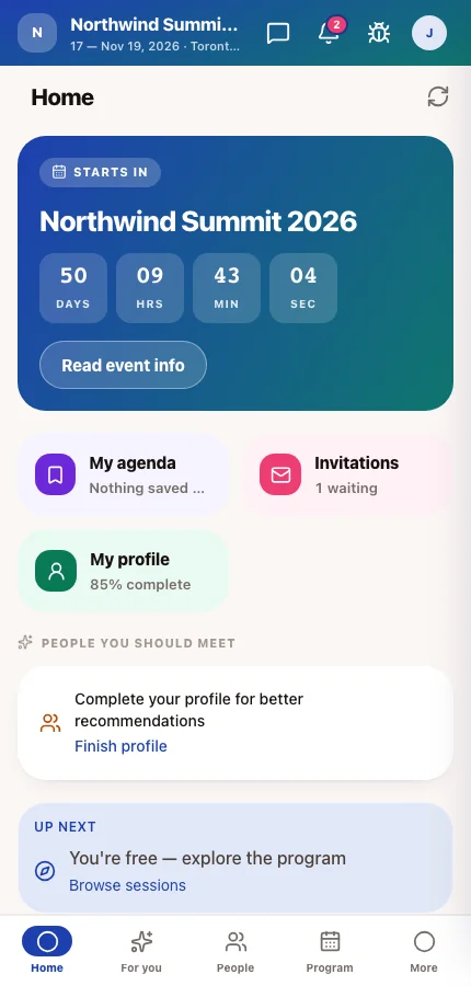
Attendees see the sections you switched on, in your order, filled with their own sessions, meetings, matches and messages.
Tips
- Keep it short on a phone: four or five sections are read, nine are scrolled past.
- Put Announcements & Polls high on event days if you use them for room changes or live polls.
- Switch on Happening Now for events with several parallel tracks — it is the fastest way into a session already under way.
- Choose counters attendees can act on. Invitations Waiting prompts a reply; a counter that never changes becomes wallpaper.